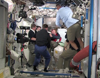
Shuttle commander Chris Ferguson continued the smooth operation sequence of the operation with a perfect docking, for the last time in the shuttle project

Today, the hatches opened between the space shuttle Atlantis and the International Space Station, after a successful docking, thus beginning the joint phase of the STS-135 mission.
The connection between the two spacecraft was the last time a space shuttle came close to rendezvous with the space station, when after the mission Atlantis will be put on display, a fate similar to that expected for its two sisters Endeavor and Discovery which are already grounded.
Atlantis docked at 18:07 after two days on a course where she closed the gap between herself and the station. Shuttle Commander Chris Ferguson successfully navigated Atlantis smoothly to its destination and exact docking location, continuing a streak of exceptionally smooth operations.
The shuttle took off for a relatively short mission of 12 days, carrying in its cargo the Rafale logistics component and a crew of four astronauts: Ferguson, Doug Hurley, Sandy Magnus and Rex Wollheim.
The shuttle also uploaded a simulation of the loading part of communication satellites and a refueling system that will be operated by the station's robotic arm, in preparation for the possibility of refueling satellites in space.

9 תגובות
Thank you very much for changing the fonts on the main page, the new fonts definitely look much more readable!
In my opinion, the fonts in the articles themselves should also be increased a bit, the current font is really borderline in terms of size, although it is possible to somehow read the text without the need for a magnifying glass, but it is still not very comfortable and strains the eyes (not everyone has 6/6 hawk vision) I would be very happy If you increase the font a little in the articles, at least one size and maybe even two.
Thank you, and refresh yourself!
Blackmail for the new design. For some reason in Firefox you don't see the website logo above. Maybe it's because of ad-block?
Another important point, the font used in the articles themselves is too small and makes it difficult to read, please increase it a little if possible so that the article can be read comfortably.
I agree with my predecessor, the font you chose for the main page (the blue text for the titles) is really hard to read and very straining the eyes, please use instead the same font you used here (on the left) it is the most comfortable to read.
Also, please add numbering to the comments, sometimes you want to refer to a certain comment and it's hard to do so if it doesn't have a number (and when a comment is deleted for some reason, don't change the numbering of messages that have already been written because then all the reference points change, do like YNet, if a certain comment is deleted then the sequence is visible Thus: 1, 2, 4, 5).
Hello to my father Blizovsky
Congratulations on the new website design
However, however
The font of the titles "Times New Roman" is really catastrophic to me
Especially when it is not highlighted / the titles come out poor and not prominent enough.
Isn't the sympathetic and elegant "Arial" better?
After all, you at least use it in the body of the article and in the comments.
With thanks - A. Ben Ner
".. Readability, the font you chose there is very uncomfortable to read and also the text itself looks very faded on the bright white background of the page. If you could please change the font there to the same font that is used for example here on the current page on the left ("School of Engineering".... "Summer Camp for Science Excellence") this font looks much clearer"
And pleasant to read!"
Agree, increase the font of the title and emphasize it!!
My father, congrats on the new design! The site definitely looks much more professional and impressive now compared to the previous design.
Just one comment, the blue titles (of articles) on the main page are very illegible, the font you chose there is very uncomfortable to read and the text itself also looks very faded on the bright white background of the page. If you could please change the font there to the same font that is used for example here on the current page on the left ("School of Engineering".... "Summer Camp for Science Excellence") this font looks much clearer and pleasant to read!
thank you and good luck!
Avi,
It would be nice if, as part of the upgrade, you would allow a close-up of the photos in the articles.
wow make the site I can't find anything #?!